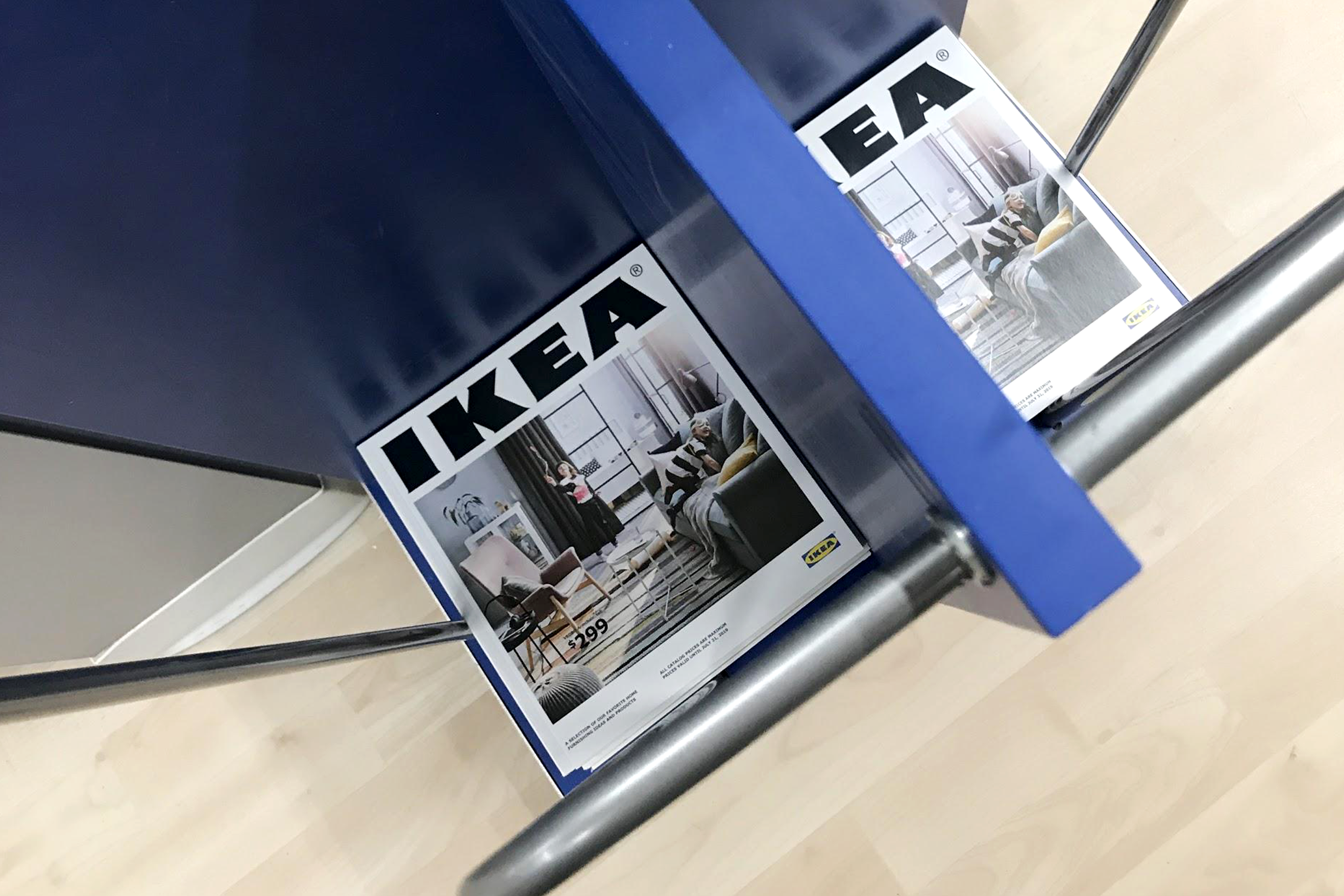
The release of the annual IKEA catalog is a mini-event, if only for the fact that it's rare for a retailer to release and mail out 288 pages of anything these days.
As retail marketers, it’s a book we refer back to throughout the year for insights. As shoppers, it’s one we keep around to spark ideas for our own spaces.
With the 2019 catalog's release in August, we wanted to take a closer look and see how IKEA translates the catalog experience for in-store shoppers. We found five simple, interesting, and thoughtful ways the catalog comes to life in-store—tactics you also may want to take note of and refer back to this year.
1. A purposeful theme, based on insights
It’s no surprise that IKEA has a strong point of view when it comes to how we live. The opening spread of the catalog makes it crystal clear.
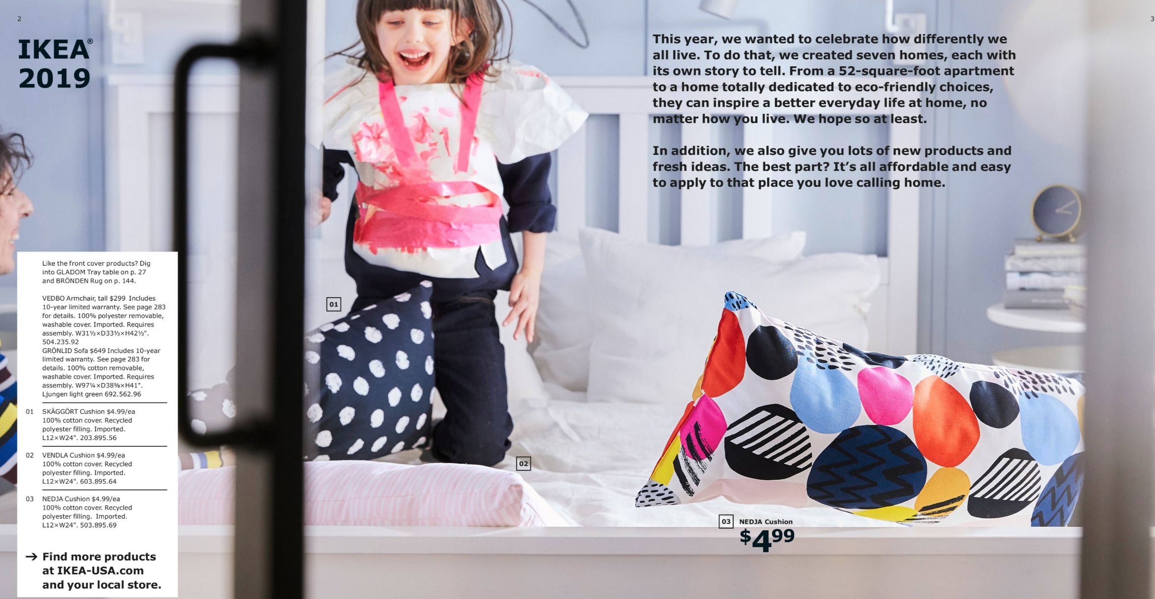
Celebrating “how differently we all live” gives the brand creative license to showcase seven different homes in the book, and to show a range of styles and solutions in-store. Interestingly, IKEA took it one level deeper, and gathered insights on its own to influence decisions made for the catalog.

The company completed a report, Life at Home, that tracked how more than 22,000 people in 22 different countries feel about their homes. From balancing technology to finding a way to navigate the pressure of living with less (what IKEA calls “the myth of minimalism”), many of its creative choices and new product developments feel like a response to what the report reveals.
How’s that for putting actionable insights to work?
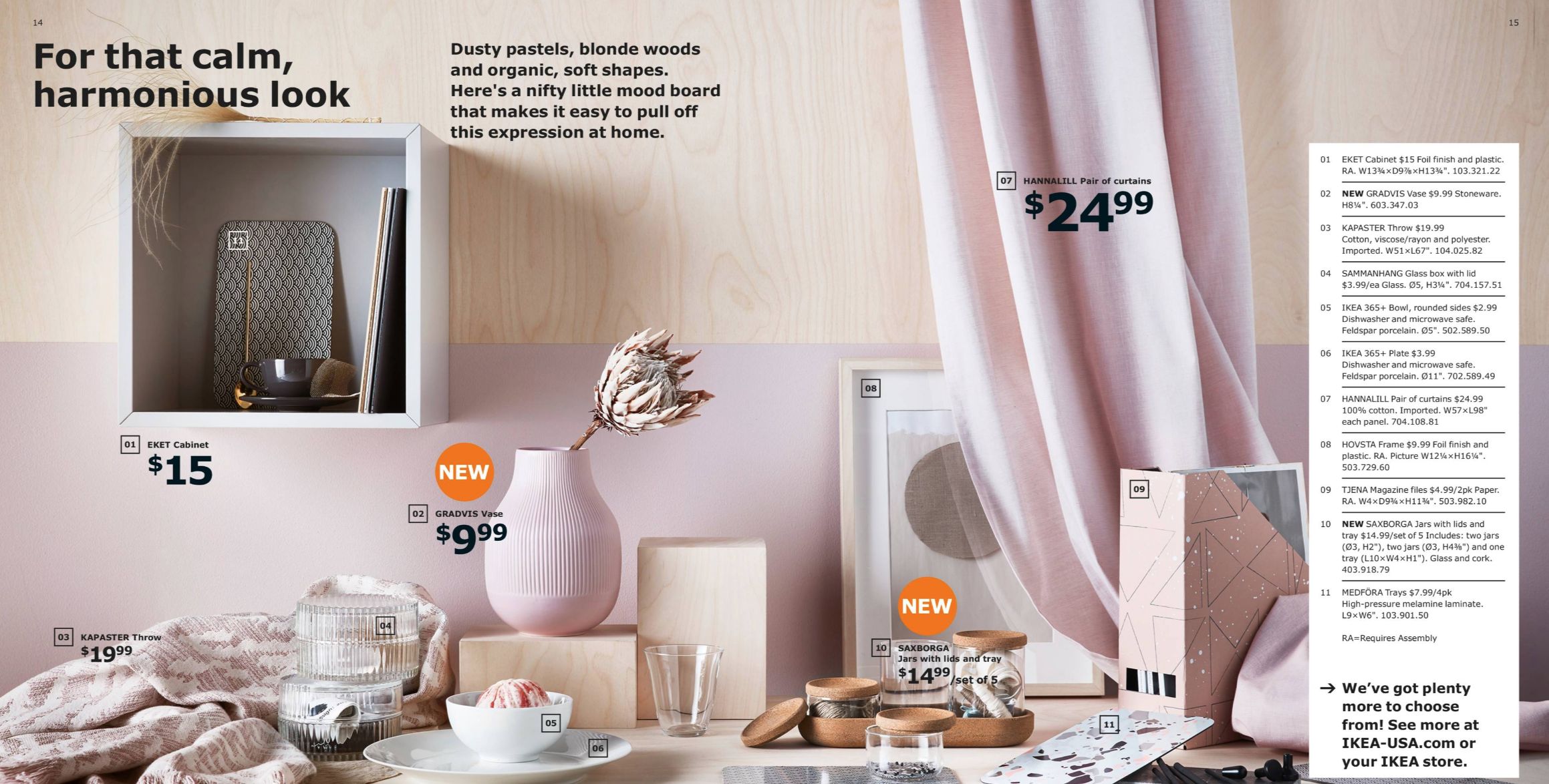
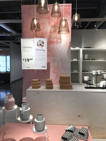
From a creative perspective, the visual identity and color palette from the catalog come to life in-store seamlessly: pinks, grays, blues, and oranges create a cohesive color story that’s quirky and quintessential IKEA.
When you’re in-store, you feel like you’ve stepped into the catalog, into IKEA’s vision of not what home can be—but is. And it’s a happy, slightly curious place to relax and dream.
2. Iconography
Another thing that’s important to IKEA? Newness.
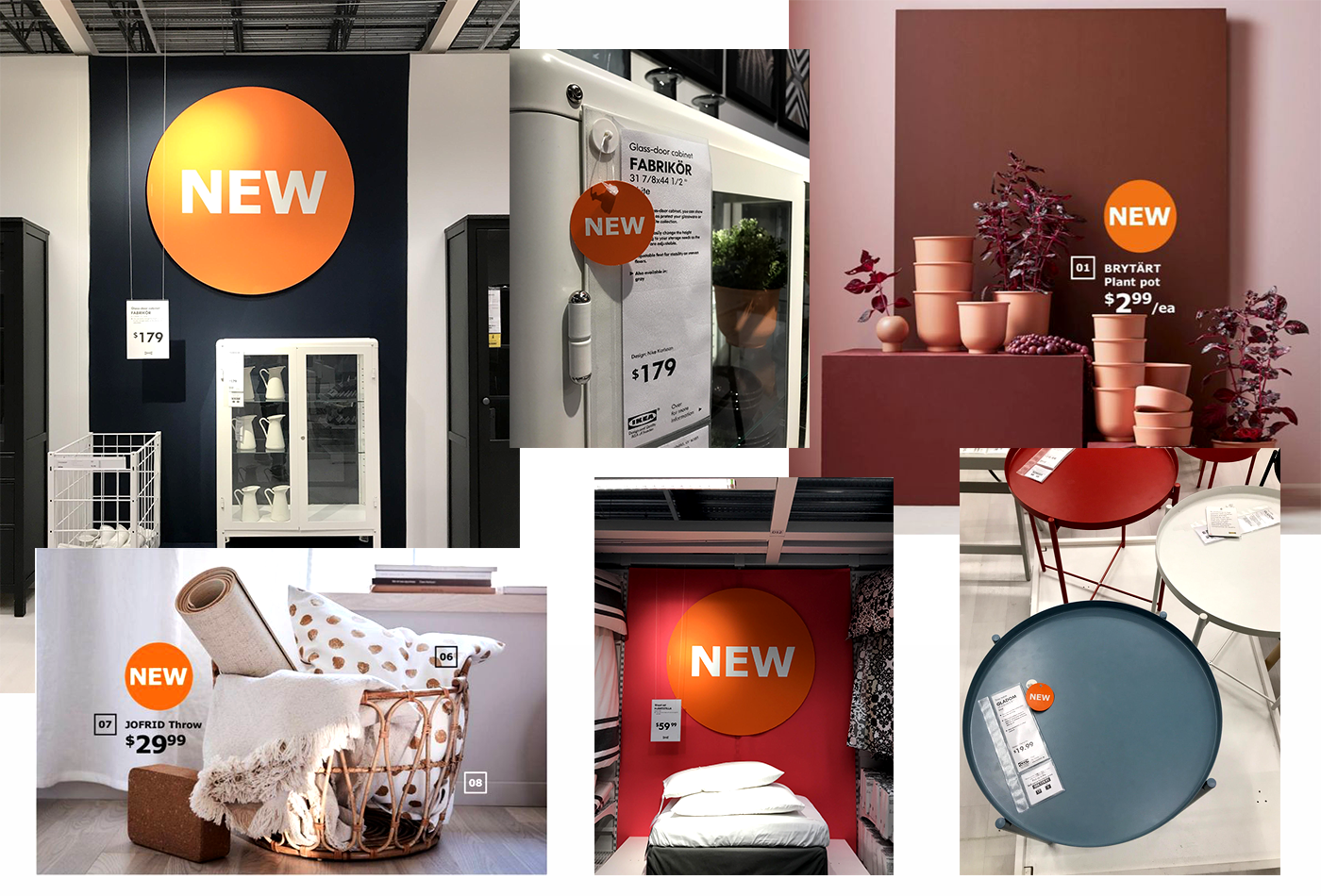
You can hardly go more than a couple of pages or aisles in-store (check out those endcaps!), without seeing its iconic orange dot whack. In addition to it signifying new arrivals, the dot whack is just as important to maintain IKEA's instantly-identifiable branding—just like Target's bullseye.
3. Storytelling
From full sentences on product hangtags to clipboards with how-tos and beauty shots of products in-use, these simple displays bring the catalog experience to the store.

They’re downright quaint—the opposite of anything tricky or digital or screen-related.
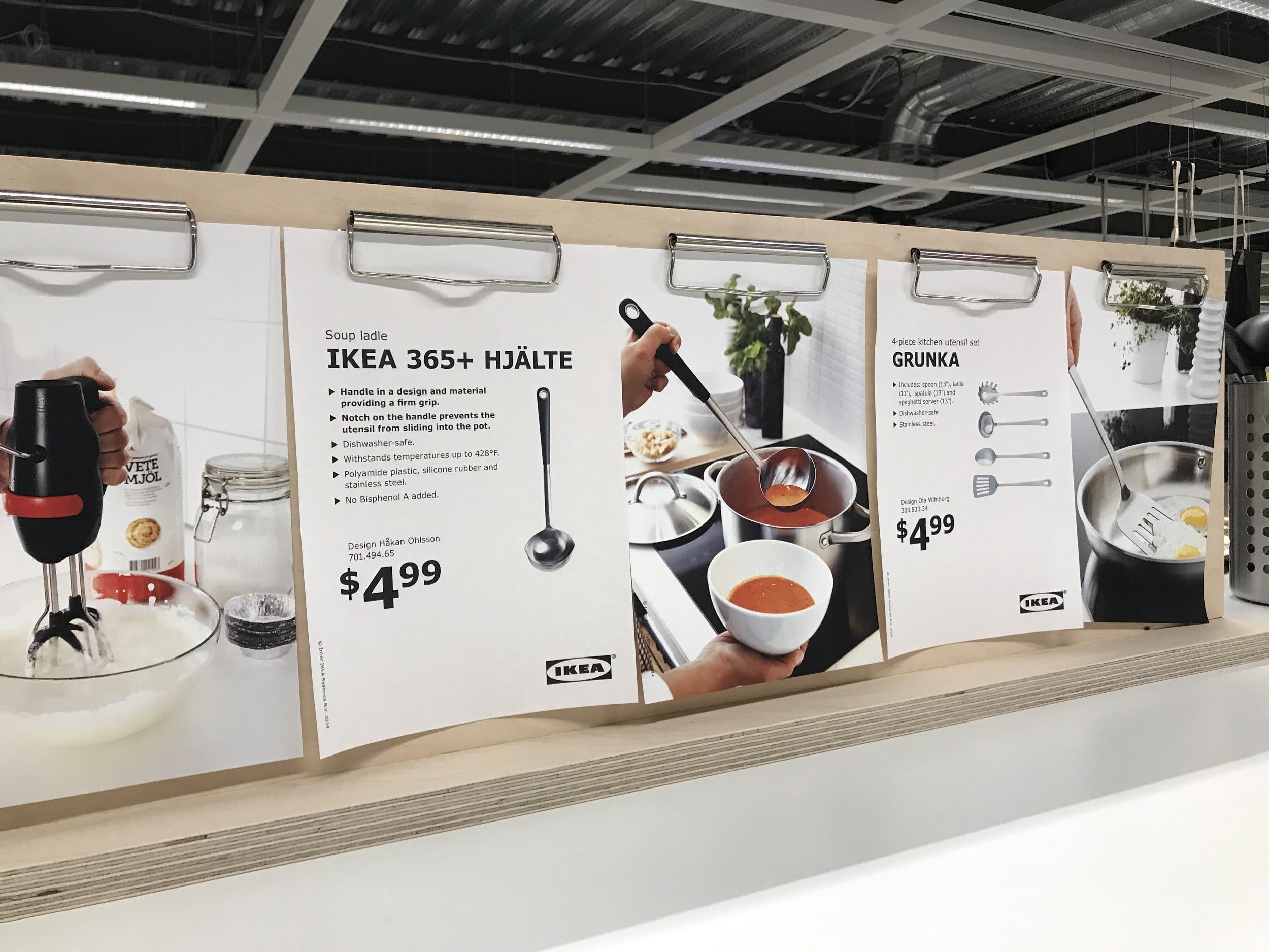
They talk to customers plainly, just like a knowledgeable associate would.
4. Whispers-to-action
The catalog itself is light on CTAs. The in-store experience is, too.
It’s almost as if IKEA is comfortable just letting you do what you’re there to do…you know, to shop and dream a little. What a concept, right?
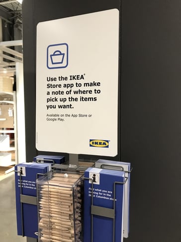
There are tech tie-ins, but they’re minimal: download the app for navigation, take a second to see the Makeovers segments we do on social media, and so on.

Plus, there's nothing that screams augmented reality, a digital advancement that IKEA got on-board with early. The digital support is there, but it’s a whisper—not a distraction.
5. The catalog itself

The catalog marks the reset of the year, so—of course—it makes sense to have the book, both as an in-hand reference tool and a takeaway right there in the store, as you’re shopping. (If you can get your hands on one before they’re all gone!)
As we move into 2019 and consider all the ways to enhance the shopping experience, basing decisions on actual behaviors is a must. IKEA does a fantastic job of creating a seamless connection between catalog, in-store, and online materials—making the buyer experience that much easier and enjoyable—which is what we all want at the end of the day, right?
What do you think about the IKEA experience? Leave us a comment below.

.png?width=100&height=100&name=KC_Headshot%20(1).png)

