
Even with a pandemic and protests happening all around the country, customers are determined not to forget dear ol’ dad this month.
In fact, The National Retail Federation expects them to spend more than ever before for Father’s Day, with the average shopper shelling out $138 on everything from gift cards to special outings to home improvement supplies.
Anticipating this windfall, top national retailers are out in full force with gift guides and other unique content that’s geared to help them get as much of that Father’s Day spend as possible.
From the ideas and tactics we surveyed, there are three we think you’ll want to pay attention to. These are the kinds of innovations that raise customer expectations, if only incrementally, and could be good ideas for your next retail or holiday event.
Amazon’s Sponsored & Branded Gift Page
All the retailers we reviewed—Target, Amazon, Walmart, Lowe’s, and The Home Depot—have gift guides for dad. On all of them, you can shop by category and brand (usually by filtering the results, which is no big deal—you can do that any time).
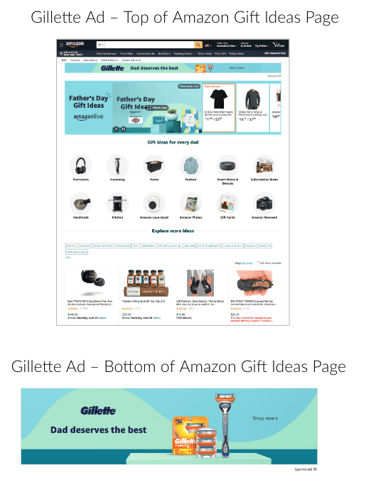
Target goes one step further by letting brands run sponsored ads that link to dedicated product pages. Amazon takes this feature the furthest.
What’s unique about its sponsored approach with Gillette® is:
1) Placement. It’s a set of at least two ads, at the top of the page and toward the bottom.
2) Experience. It’s a dedicated, Father’s Day-branded landing page, not a generic ecommerce page of product.
3) Exclusivity. We don’t know how many sponsored gift pages could exist (we only saw the one from Gillette®), but it’s safe to say the number is limited. This kind of prime (pun intended) placement could only be sold for a premium.
Take a closer look:
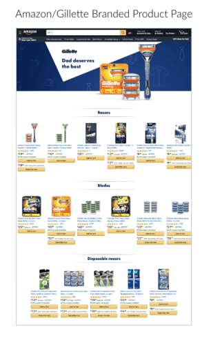
This approach is interesting, if underutilized at the moment. It’s still a product page, but it’s a step in the right direction. What if—in the future—the pages featured more dynamic, engaging modules, like Brand Stores or Premium A+ content can? What if they had spaces for other callouts and links to other product categories? Especially for new or emerging brands, it’d be a great way to legitimize the company and get in front of a ton of new customers.
Target’s Beefed-Up Category Pages
The second dad’s day thing you need to see… look at the souped-up content that sits above the ecommerce grid on these Father’s Day category pages!
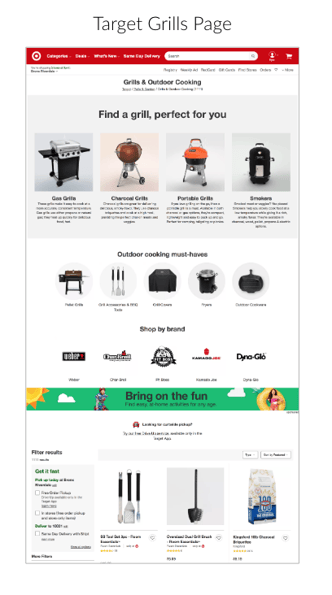
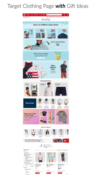
As long-time lovers of catalogs and the more in-depth, useful information they provide, we’ve been longing to see ecomm pages get a lot more engaging. Usually, they’re just rows of products. Sometimes you get a category header graphic.
What we’ve always wanted? Selling AND storytelling.
On the Target pages, we’re able to learn stuff (how to pick a grill!), see some deals, or navigate to some other style stories that might be more relevant (and specific) than what’s displayed on the page itself.
It’s useful, but the selling vs. storytelling balance would have to be looked at a little more closely. The clothing landing page gives too much to focus on or click away to—and maybe the Pride module isn’t the most persuasive message for most customers shopping for most dads. But, executional gripes aside, having deeper information on an ecomm page is yet another step in the right direction.
Lowe’s Hashtag-Fueled Celebration
Don’t go too deep into this one, or your bottled-up pandemic and protest feelings might come pouring out!
Lowe’s decided to put a face on Father’s Day by celebrating handy dads across the country. It encourages followers to share what their dads built by using the hashtag #DadBuiltThis. And, to get some traction and to support a beloved creator, the company looped in Rob Kenney of @dadhowdoi. (Kenney’s content answers how-to questions “for those who don’t always have a dad to ask”). Why are my eyes raining?!
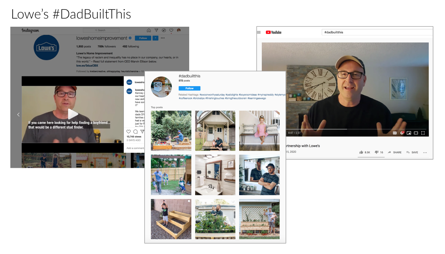
The campaign is supported by other influencer dads on Lowes.com, where each curates about a dozen products that would be great dad’s day gifts.
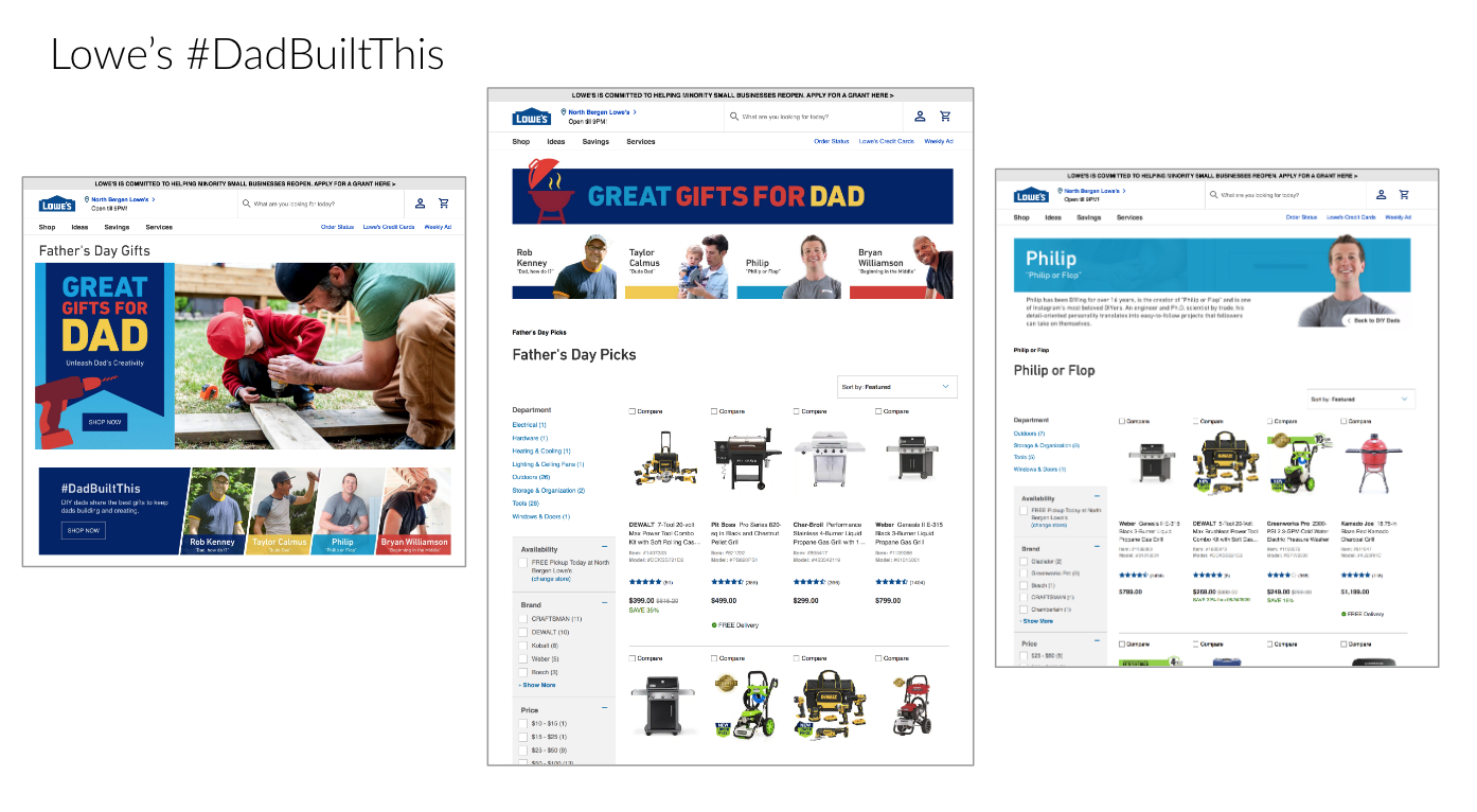
The execution isn’t flawless. We’d love to see some explanation on why the dads chose the tools they did—the kind of content you could find in a beautiful catalog spread or sidebar. But... the emotion of the campaign feels so pure and well-intentioned that we’ll let this one slide!
In Summary: Why It Matters
There’s a common thread that runs through all three exceptional Father’s Day landing page executions: balancing selling and storytelling. The examples demonstrate how online experiences that make you feel something or learn something don’t have to get in the way of your shopping journey.
We’re happy to see the stores trying new things and being more human—not just transactional.
It comes back to why we’re so passionate about content in the first place:
Good content drives connections. Customers connect with products and solutions that can help them out. And they’re also reminded of the bigger reasons WHY they want to shop in the first place.
We think that’s something customers deserve from retailers and retail events, all year long—and we’re glad the ecommerce environment seems to be finally catching up.
.png?width=100&height=100&name=KC_Headshot%20(1).png)