Think back to the last small appliance you bought. Where did you “shop” for it (reviewing your options, checking different products and prices), and where did you end up buying it?
Although many retailers are finding their customers do online research before stepping foot in the store, they still have to be prepared for those who don’t. They have to communicate product benefits quickly and simply, with shelf-level signs, tags, stickers, and small displays. These small tactics play a big role in helping customers make good purchase decisions. Retailers can do their best to win that “moment of truth” or lose that sale (and opportunities for repeat purchases and loyalty) to someone else.
If you take a look around… you might think some stores have forgotten this very important part of their business.
We took a look at three retailers to see who’s doing what in-store, related to small appliances. While, of course, each store is different and the locations we audited were chosen at random, we think it’s an interesting snapshot of how some retailers employ tactics that are helpful, while others are leaving money on the table.
The Good: Bed Bath & Beyond
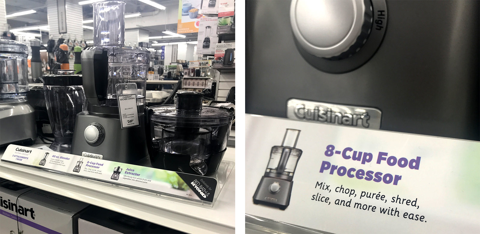
Let’s say you’re in the market for a juicer. You walk up to this shelf at Bed Bath & Beyond, and you can quickly find the right one for you. How? These products sit on a clear plastic shelf with a product card in front that tells you what (they think) you need to know most. Product name? How powerful it is? What you can do with it? And a checklist that compares all of them? Yes, please.
Let’s say you’re not in the market for a juicer, but you wander past this display while in the store. It’s clean and organized, so it grabs your eye. You might just bite the (nutri) bullet and buy it. Success.
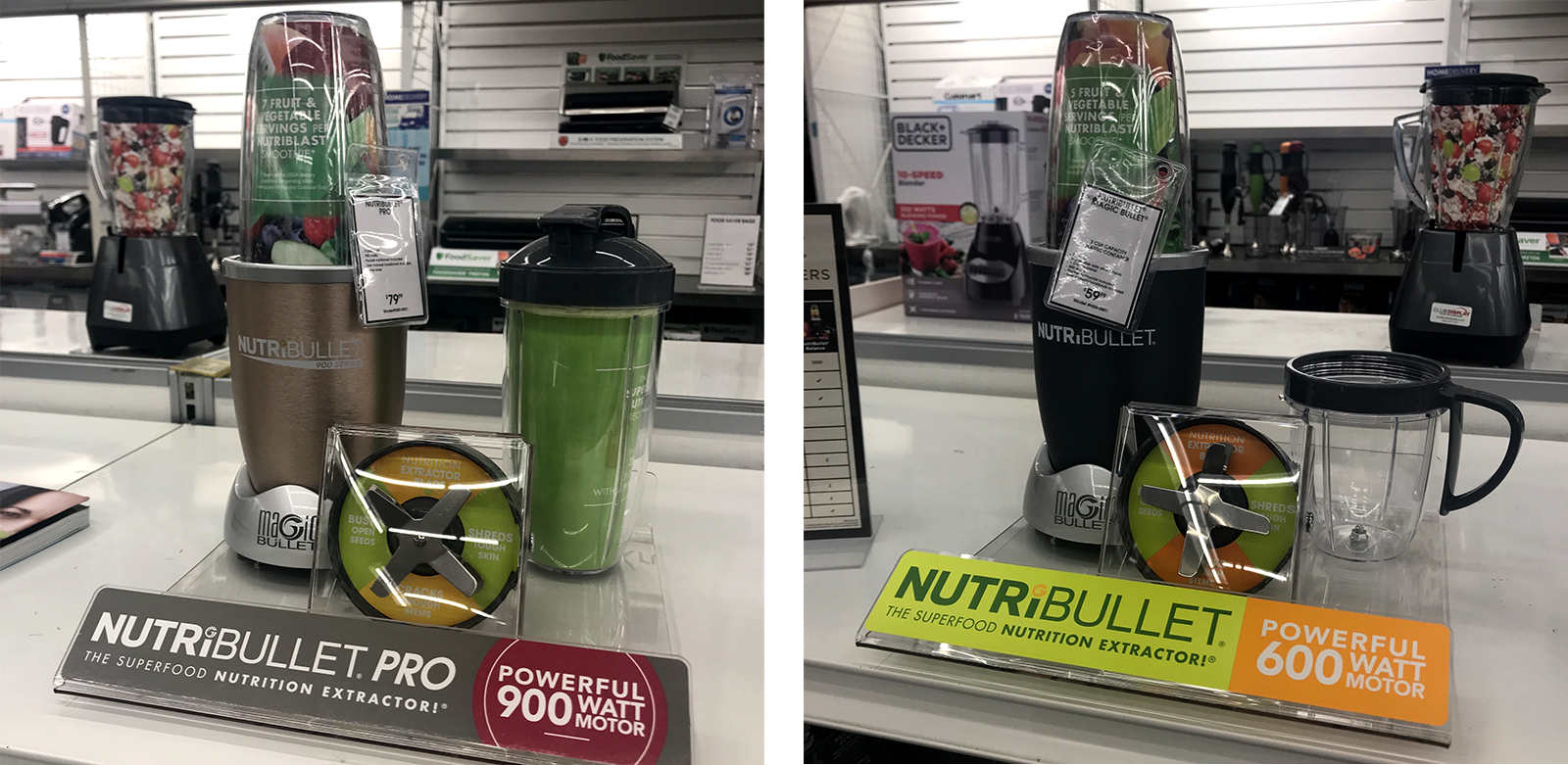
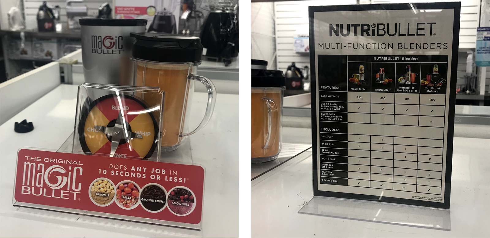
It’s not just the NutriBullets that have these displays, either. Check out some of the others.
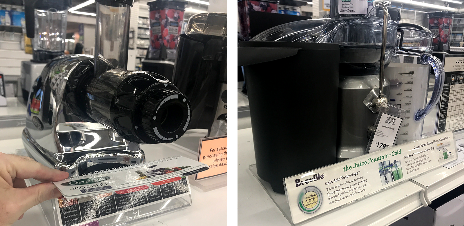
The Bad: Best Buy
If you’re buying a blender or slow cooker at Best Buy, I hope you’ve already done your homework.
There are, like, somewhere between 25 and 5,000 different products on these shelves. Some have product tags, stickers, or signs—but most don’t. As a customer, you’d have no idea which is the right one for you, or why Best Buy has decided that these specific items deserve precious shelf space.
You could “ask a Blue Shirt,” but would you feel very confident that they’d really be able to walk you through the options?
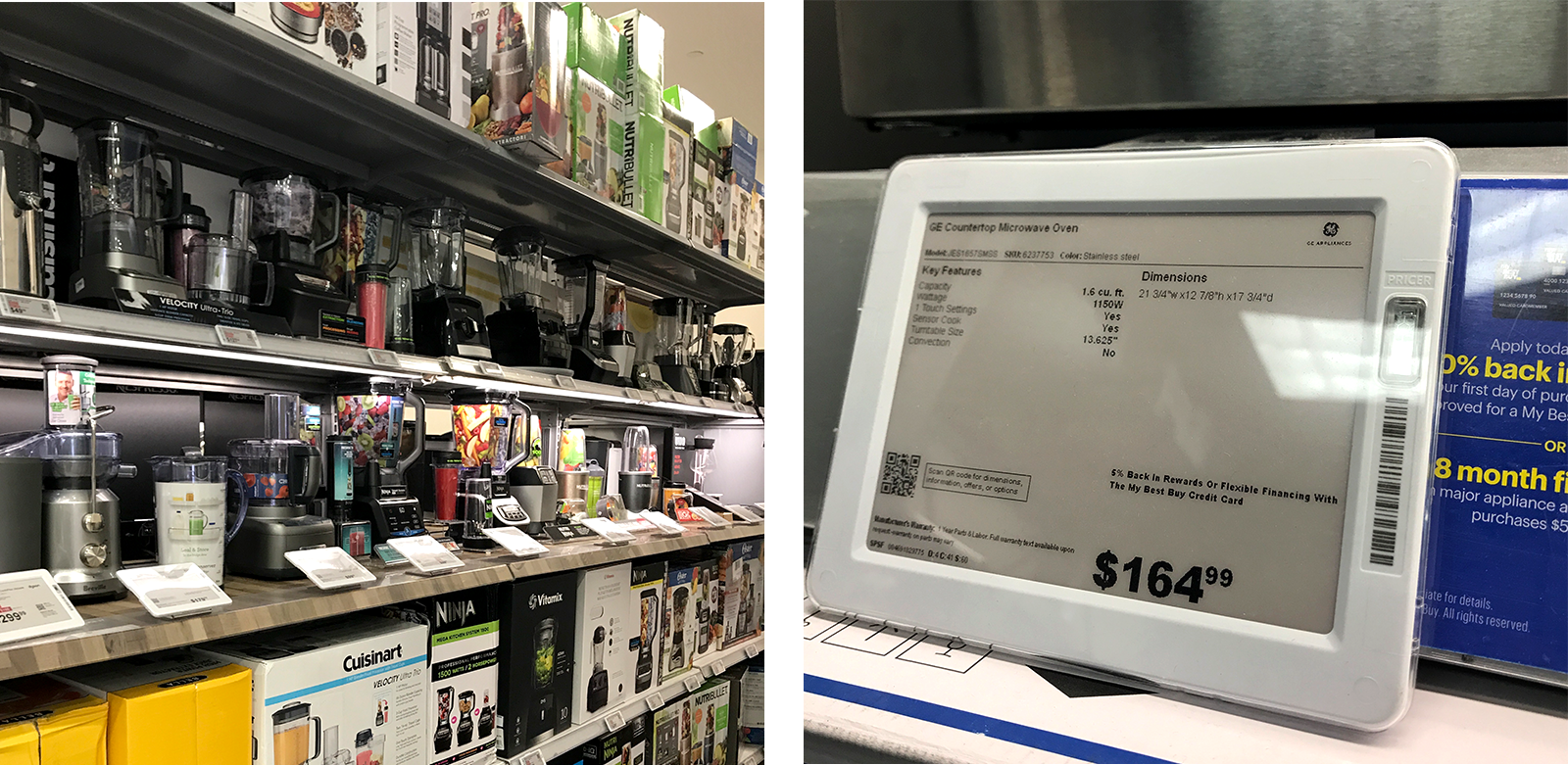
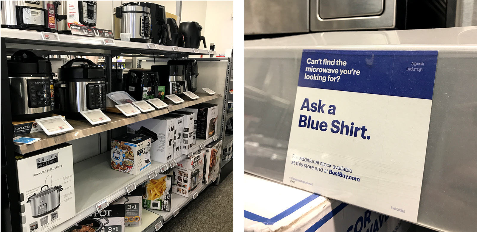
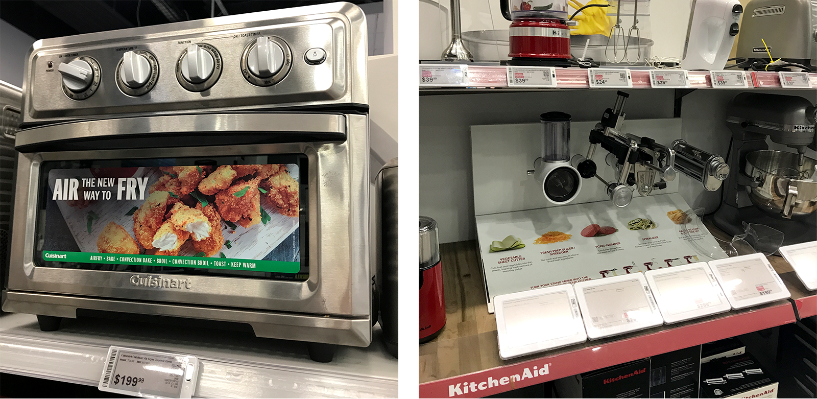
There are some (vendor-funded?) product information bright spots at Best Buy… but overall, this environment is not helpful. We know from other displays we’ve seen that they know their way around in-store signage and good/better/best stories, but for some reason, the kitchen electrics have no spark.
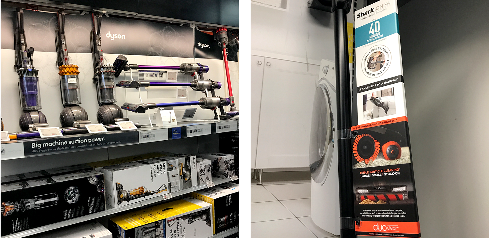
The Ugly: The Home Depot
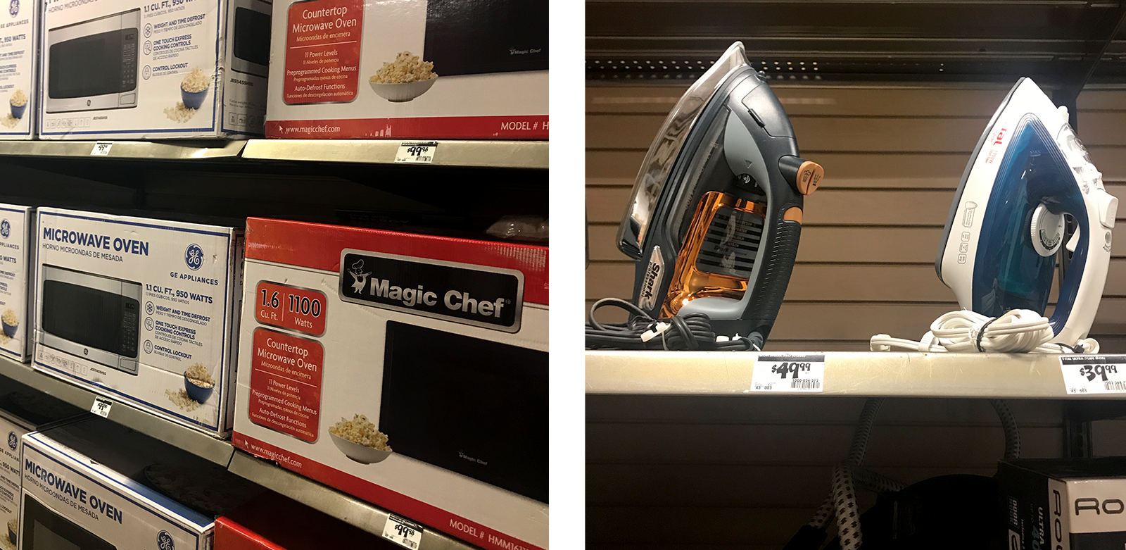
Have you ever seen a sadder set of irons? A less enthusiastic (I don’t even know what it is…) air purifier? I don’t know her, but I’m pretty sure that fabric steamer deserves a shot at a better life.
The Home Depot just recently put a lot of good energy into a Back to Campus event, but this forgotten spot (which has some dorm-ready items!) doesn’t make the grade.
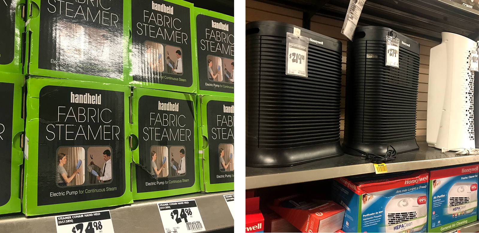
There are some signs of life near the vacuums… and this air filter hang tag is sort of useful… but overall, it’s safe to say that this must not be a priority category for them.
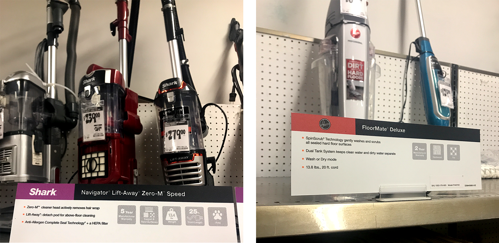
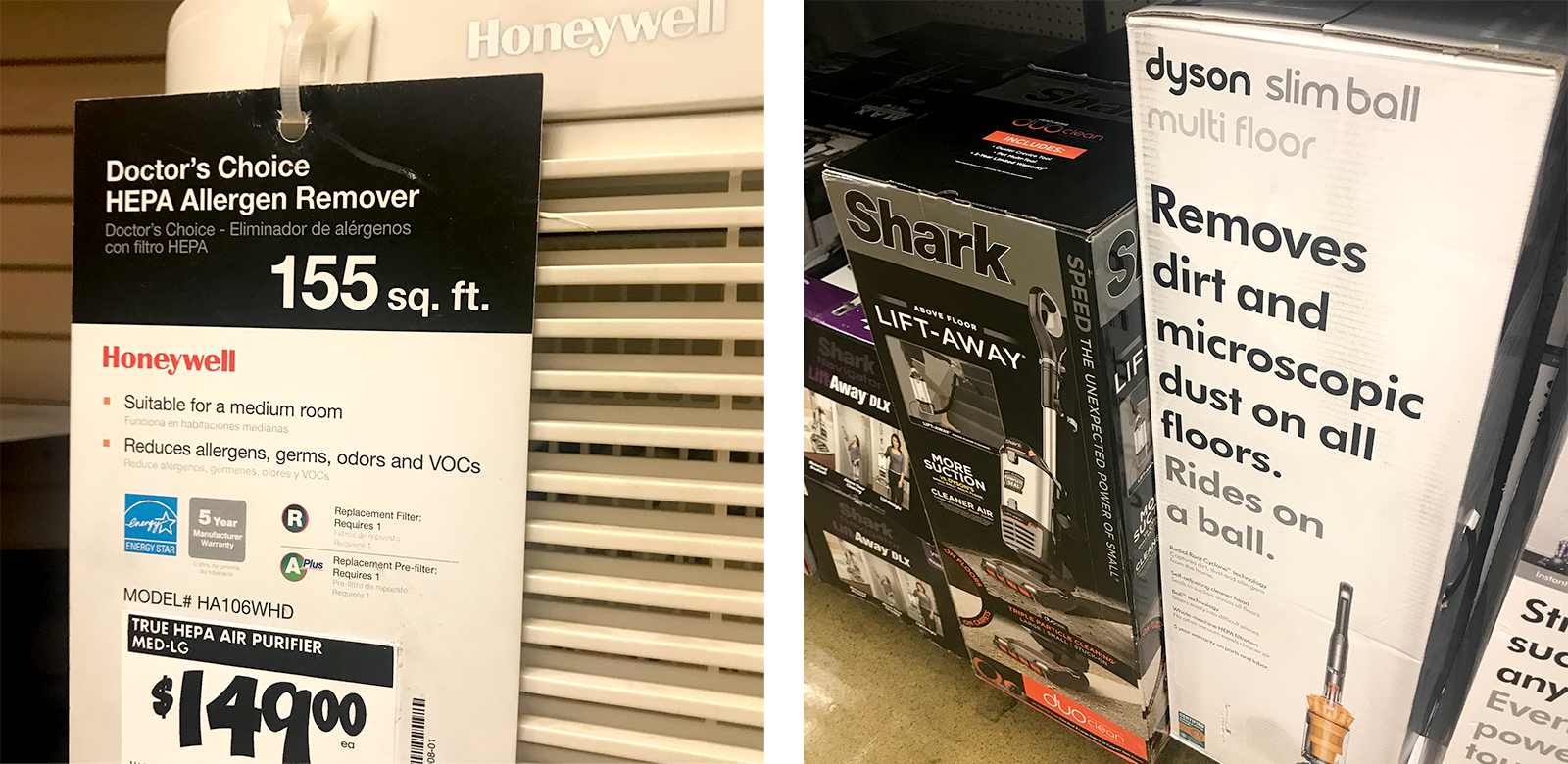
It’s wonderful that we can read reviews, compare prices, and see demo videos of products we want to buy on the internet. But it’s also a mistake for retailers to completely forsake the in-store experience and rely on customers to do all of that intellectual and emotional labor on their own. To have to pull out their phones (hello, shoddy in-store wi-fi) or be forced to scrounge around on their knees looking at product boxes, like an animal… I think we should expect better, people.
We know that retail isn’t easy and consistency at the store level can be a beast to maintain, but the fact remains: an in-store experience has to serve all types of customers. Whether they’re just shopping around or are ready to whip out their wallets, how stores support that moment of truth makes all the difference in not only what they buy but also how they feel about the overall experience.
Curious about how one of your competitors supports (or doesn’t support) one aspect of the entire shopper journey? Let us know, and we can help!

.png?width=100&height=100&name=KC_Headshot%20(1).png)

