You’re used to hearing that it’s the “holiday shopping season.”
And you know when “back-to-school shopping” is coming up.
We’re conditioned to be mindful of the major shopping dates on the calendar, which only further increases the hype – and the pressure on brands and retailers to make sure they have better deals than their competitors. And as we’re now approaching the peak of appliance shopping season (yes, it’s a real thing) in September and October, we’ve covered in this series’ first two blogs both the trends and approaches we’ve seen from major brands, and taken a deeper dive at two of the biggest names in the game.
Before we look at some of the creative approaches that we like – and a few we think could be improved – let’s rewind and go over what we’ve covered and discovered so far.
We know appliance shoppers make a buying decision within a week of beginning their searches. What does that mean for you, as a brand? It means you need to be prepared with a repository of content to deploy across all stops on the consumer journey: website, social media (both organic and paid), email, and web ads.
Appliance shoppers are high-intent shoppers, so you don’t need to condition them or bring them along slowly with your content marketing. They’re buying – it’s just a matter of where and from which brand.
So, who does it well, and whose approach needs some work? In the previous blog, we looked at The Home Depot and Lowe’s–the two biggest retailers in appliances–but this time around, we’re leaning into a few of the brands themselves.
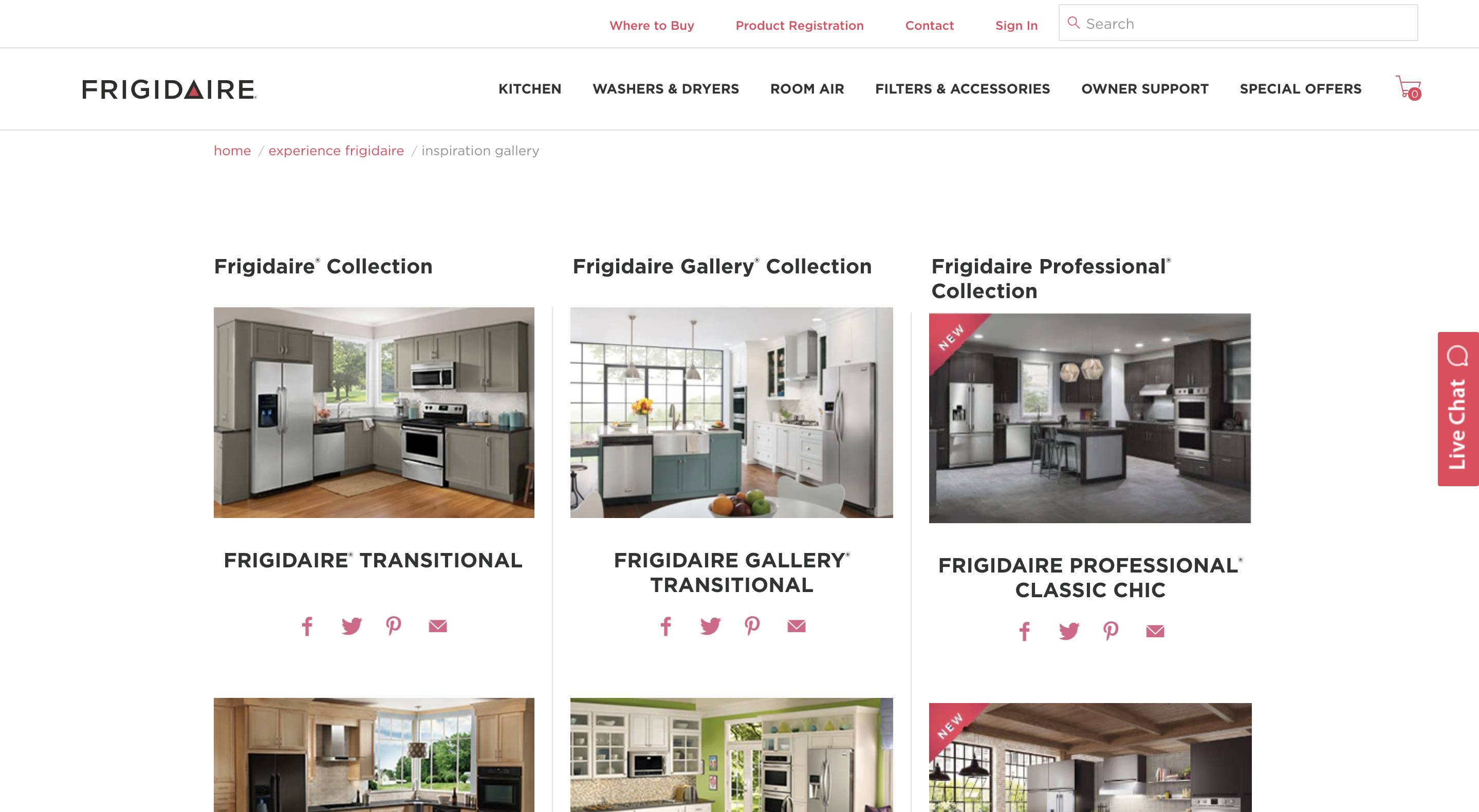
Frigidaire – We LOVE the Inspiration Gallery feature.
This is a souped-up, creative solution to a PDP or enhanced content. Not only can you view a wide array of products and the various functions they serve, Frigidaire gives customers a clean look at how the products will look in their space. And it’s not just one space; the brand offers you the ability to view different products in different types of spaces.
Frigidaire is one of the world’s top kitchen appliance brands, and based on their layout and design, they’re thinking ahead and trying to offer shoppers a robust, comprehensive shopping experience that’s consistent with retailers. Good work, Frigidaire.
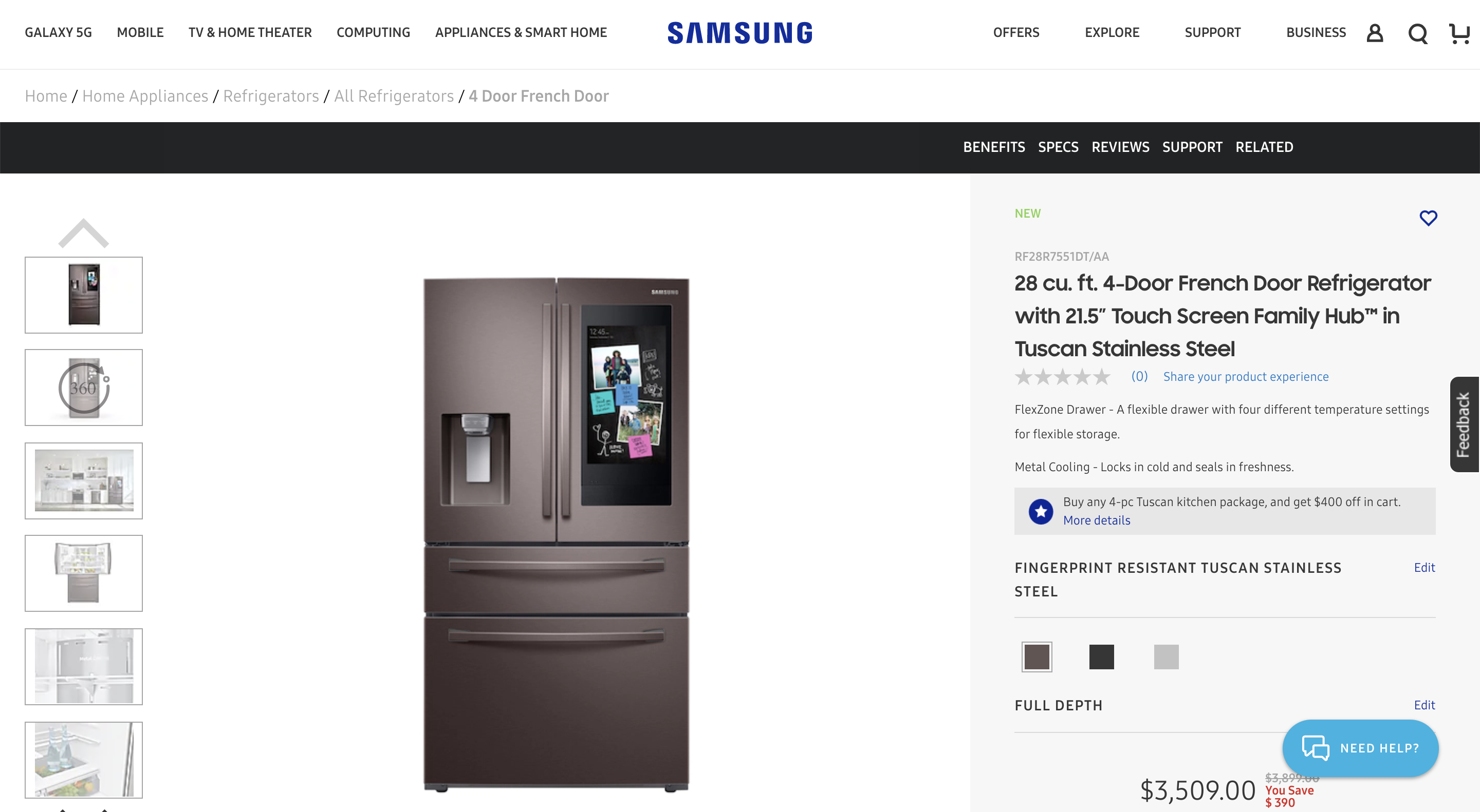
Samsung – Innovative, creative, and checks all the boxes.
This is a really strong user experience on Samsung’s website. From left to right on the screen, customers are getting exactly what they’re looking for – especially considering they’re already well down the road on their path to purchase. Samsung offers high-quality imagery, a 360-degree view of the product, and multiple looks at the product in an actual space.
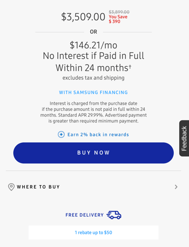
Once you scroll down to look at the price (we all do this), Samsung gives you all the details you want: financing options, delivery options (hello, free delivery!) and a prominent list of the additional benefits that come with buying directly from its site.
Alright, those are a couple of our favorites. Now, to the not-so-favorites...
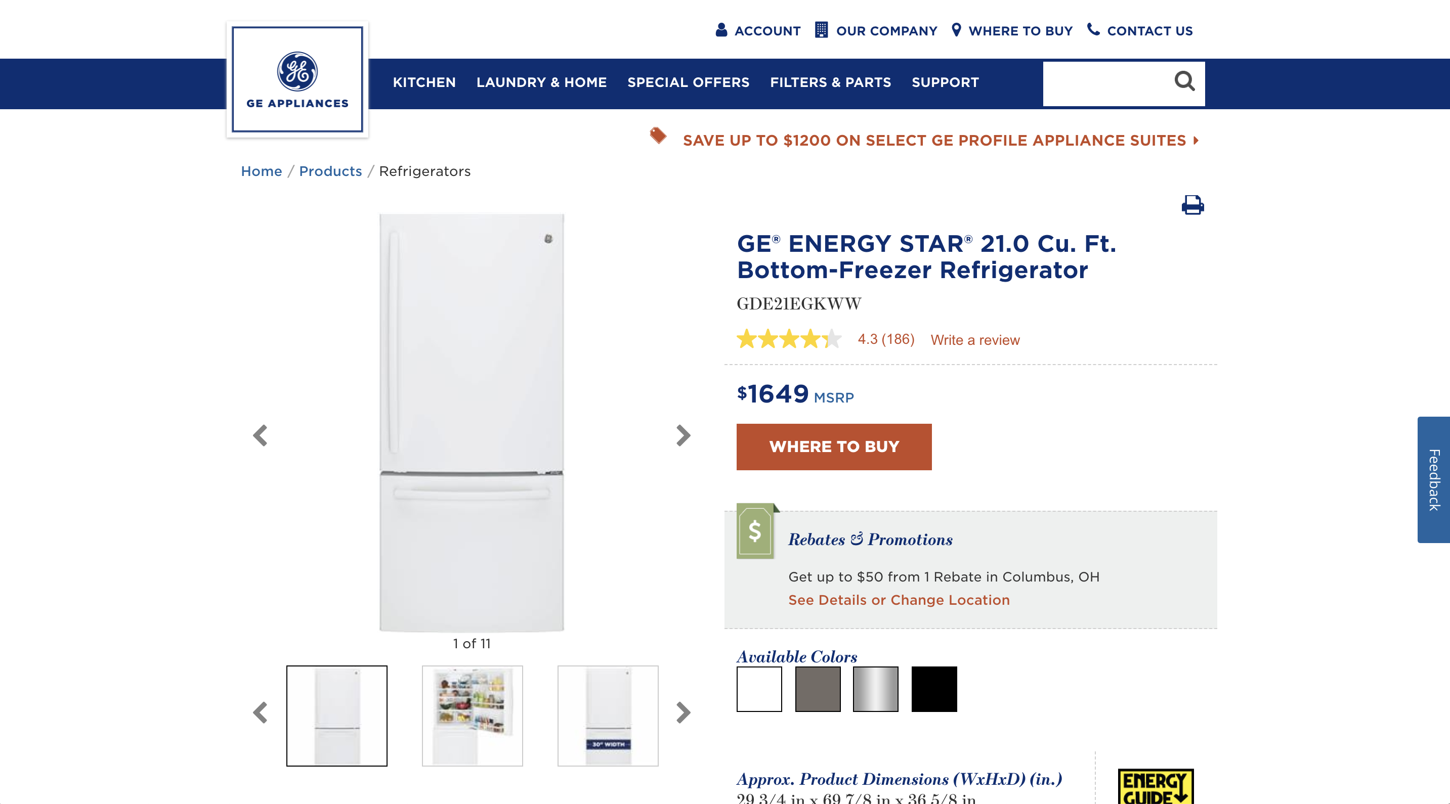
General Electric – A little too busy for our taste.
The main takeaway from GE’s product pages is that they feel catered toward a customer who is early in the buying process. There’s a LOT of information and clutter – sometimes it’s hard to distinguish between what GE wants the customer to know, and what it’s including for the sake of including it.
Where does GE want you to navigate? That’s the question we’re left with. And, there’s a lack of video and “realness” that GE’s competitors are utilizing in their creative.
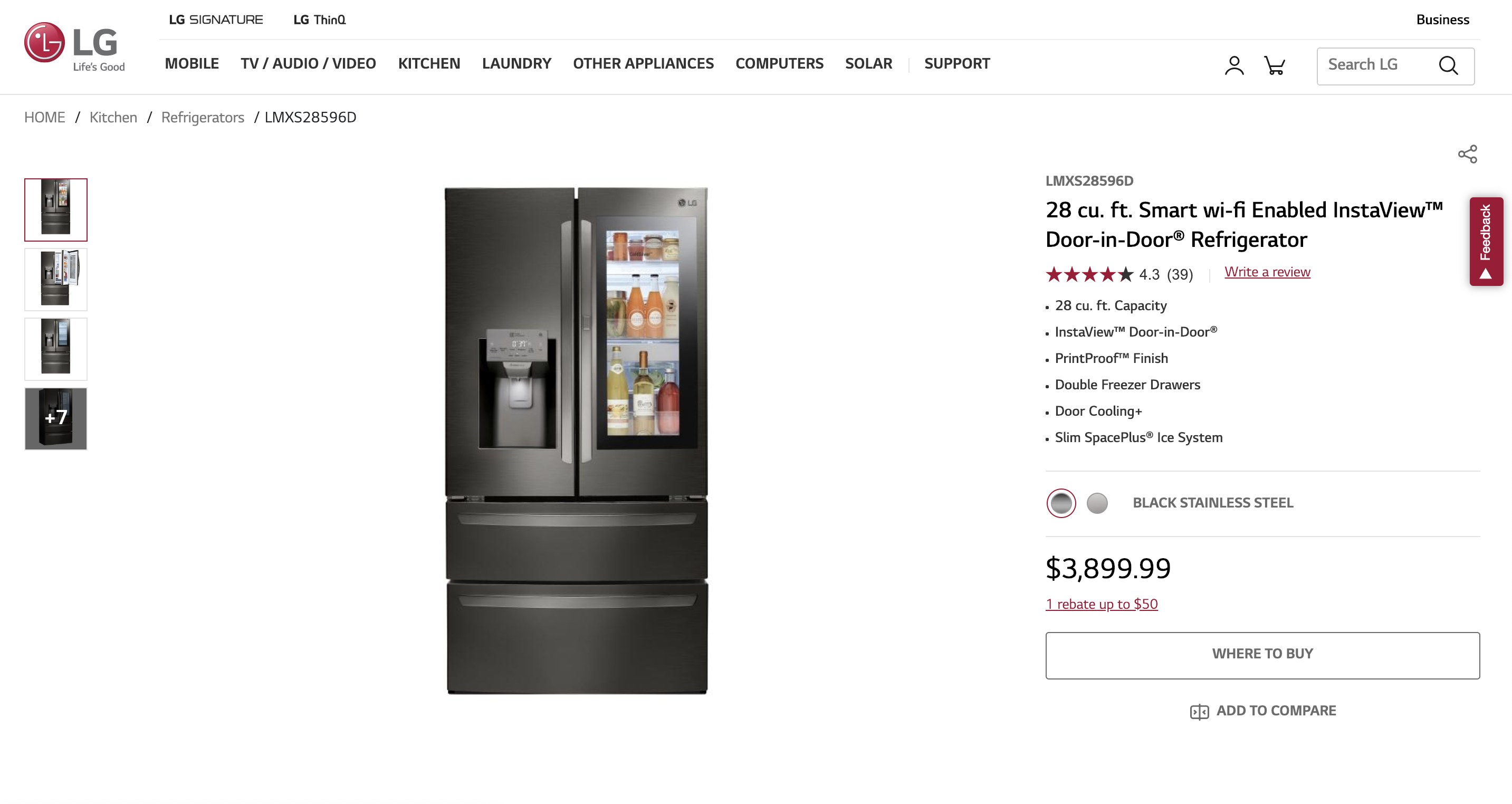
LG – Burying the lede.
LG is known for its innovative appliances (they’re a tech-focused company, after all), so it’s surprising to see the company make no mention of the technology in its appliances until the customer gets way, way, way down the product page.
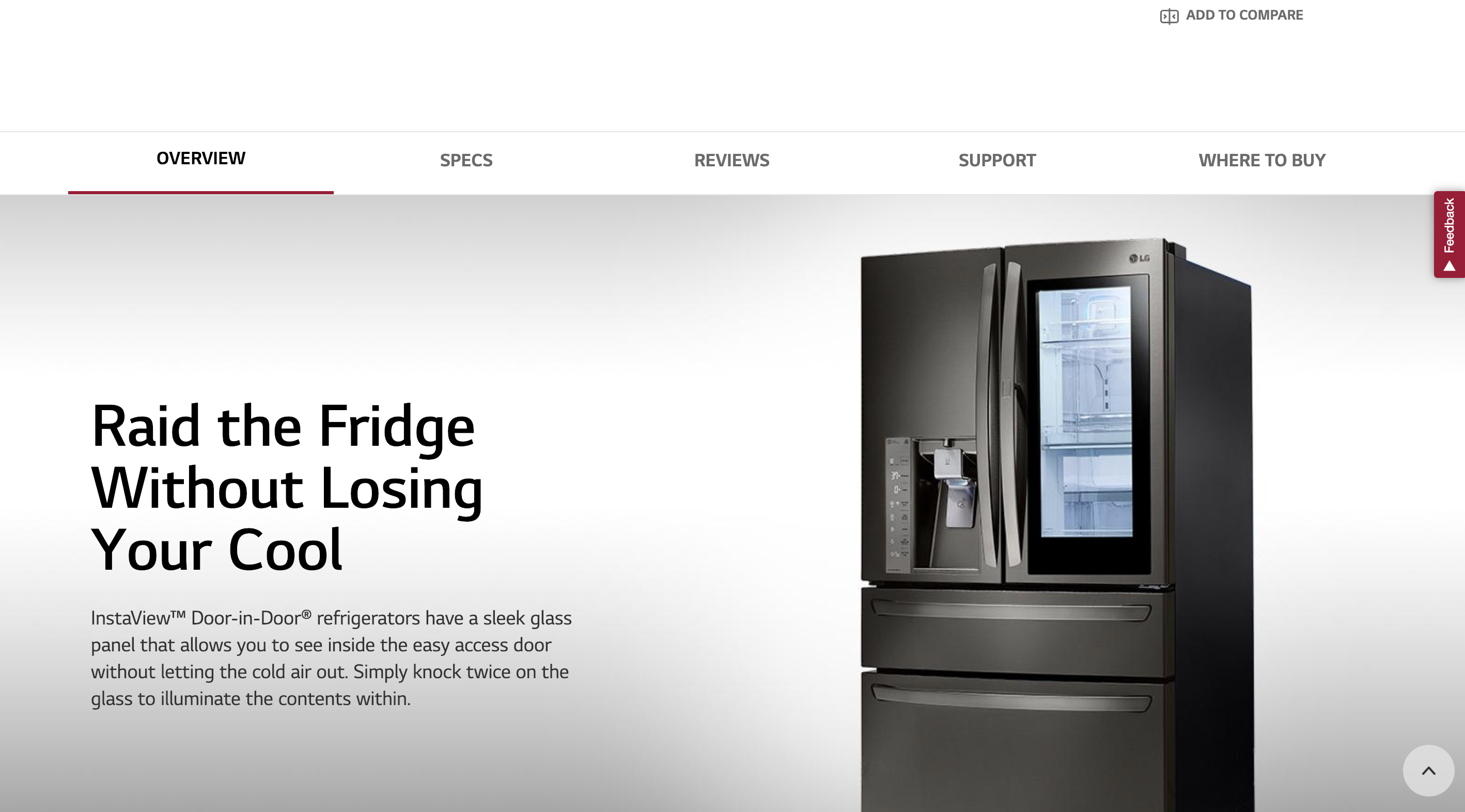
Also, when a customer arrives at the landing page for specific appliance categories, the first thing she sees is a HERO image of consumer ratings.
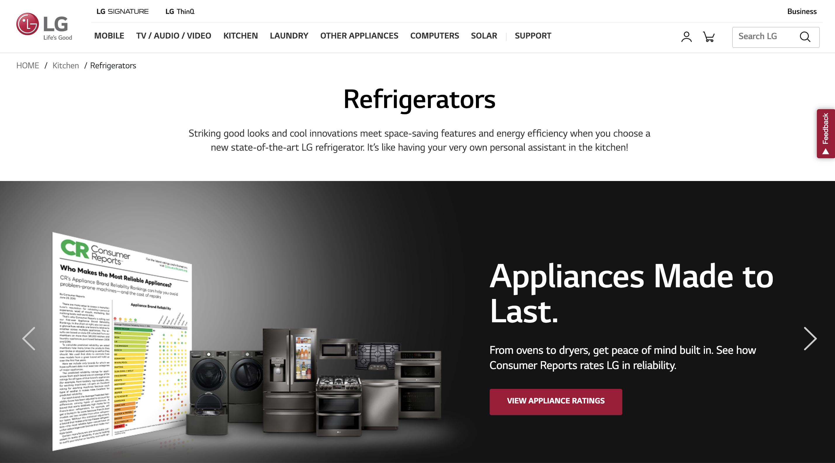
Considering what we know about the intent of appliance shoppers, is this the best experience? It's debatable whether they REALLY need to know this upfront, without first exploring the products on the product page.
It's also another product showcase that doesn’t feature video or a real-life look at the appliance. All of the images on the product page are shot on white backdrops, and a customer can’t see what the product would look like in her kitchen (a feature we know is important).
The download
Now that we’ve highlighted a couple of appliance brands doing enhanced content well–and a couple who could improve their experience–we can tie this into one key takeaway.
The enhanced content on your product pages must FURTHER the customer’s buying process. The best brands in this space design PDPs to capitalize on the intent displayed by appliance shoppers, giving them exactly what they need to make a decision and then offering the most efficient way to get the appliance in their home (purchase, financing, delivery, etc.).
Keep that in mind when laying out the enhanced content on your product pages: the customer, more likely than not, wants to buy now. And accelerating that buying decision can be attained by creating quality, beneficial content that moves them toward the checkout—not away from it.

